
When it comes to marketing, color and design play a pivotal role in capturing attention, conveying messages, and driving conversions. However, much of what we think we know about color psychology is oversimplified or downright incorrect.
In today’s post, we’ll dive deep into the true impact of color and design on your marketing efforts and how to leverage them effectively to dazzle your audience, win leads, and boost sales.
The Myth of Universal Color Meanings
You’ve probably heard statements like:
- Blue equals trust.
- Red signifies power.
- Purple induces relaxation.
While these associations might hold true in certain contexts, implying that each color has a universal meaning for everyone, regardless of background, culture, or personal experience, is simply false.
Color perception is subjective and varies widely among individuals. Factors such as age, gender, culture, and personal experiences all influence how we perceive and react to different colors.
Understanding Color Preferences Across Demographics
To choose the right colors for your audience and products, it’s essential to consider demographic data and preferences.
Color Preferences by Age
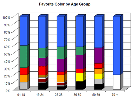
Research by Joe Hallock reveals that color preferences change as we age:
- Younger individuals tend to prefer bold, vibrant colors with longer wavelengths like red, orange, and yellow.
- Older individuals generally lean towards cooler, subdued colors with shorter wavelengths such as blue, green, and purple.
Understanding your target audience’s age demographics can guide you in selecting colors that resonate more effectively.
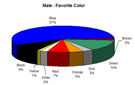
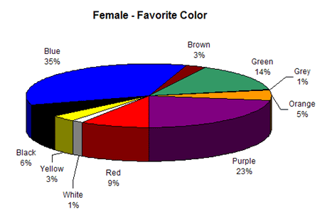
Color Preferences by Gender
Hallock’s study also highlights significant differences in color preferences between genders:
Men’s Preferred Colors:
- Blue
- Green
- Black
Women’s Preferred Colors:
- Blue
- Purple
- Green
Men’s Least Favorite Colors:
- Brown
- Orange
- Purple
Women’s Least Favorite Colors:
- Orange
- Brown
- Gray
Additionally, other studies indicate:
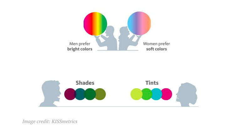
- Men prefer bold colors and shades.
- Women prefer softer colors and tints.
While these findings provide valuable insights, remember that individual preferences can vary. Use this data as a starting point, but always consider your specific audience’s context and feedback.
Applying Color Effectively in Marketing
Beyond catering to preferences, colors should be used strategically to enhance readability, evoke appropriate emotions, and guide user actions.
Enhancing Readability and Clarity
- Contrast: Ensure there’s a strong contrast between text and background colors (e.g., black text on a white background) to improve readability.
- Consistency: Use a consistent color palette throughout your marketing materials to establish brand recognition.
- Accessibility: Consider colorblind users by avoiding problematic color combinations (e.g., red and green together).
Highlighting Calls to Action (CTAs)
- Use accent colors for CTAs that stand out from the rest of your design.
- Ensure CTA buttons are large and prominent, making them easy to spot and click.
- Test different colors to see which yields the best conversion rates with your audience.
Essential Design Principles for Higher Conversions
Good design complements effective color use and is crucial for creating marketing materials that convert.
Keep It Simple and User-Friendly
- Clean Layouts: Avoid clutter by using ample white space, making content easy to navigate and digest.
- Responsive Design: Ensure your design looks great and functions well on all devices, including mobile phones and tablets.
- Consistent Typography: Use standard, easy-to-read fonts like Lato or Open Sans and maintain consistency throughout your materials.
Focus on Hierarchy and Emphasis
- Headings and Subheadings: Make them larger and more prominent than body text to guide readers through your content.
- Visual Cues: Use images, icons, and infographics strategically to support and emphasise key points.
- Avoid Distractions: Steer clear of auto-playing videos or carousels that can divert attention away from your main message.
Practical Design Checklist
Use this quick checklist to ensure your marketing materials are designed for maximum impact:
- Font Choice: Standard, readable fonts (e.g., Lato, Open Sans).
- Font Size: Minimum 18pt for body text; larger for headings.
- Color Contrast: High contrast between text and background.
- White Space: Adequate spacing to avoid clutter.
- Responsive Design: Optimsed for all devices and screen sizes.
- CTA Design: Prominent, contrasting colors and appropriate sizing.
- Visual Consistency: Uniform color palette and design elements.
- Avoid Distractions: No unnecessary animations or auto-play media.
Regularly review and update your design elements based on user feedback and performance metrics to continually improve your marketing effectiveness.
Conclusion
Choosing the right colors and design elements for your marketing isn’t about following simplistic rules; it’s about understanding your audience’s unique preferences and crafting experiences that resonate with them on a deeper level.
By:
- Recognising the subjective nature of color perception.
- Leveraging demographic insights to guide color choices.
- Applying design principles that enhance usability and readability.
You position your brand to connect more authentically with your audience, stand out from the competition, and drive meaningful conversions.
This post wraps up our 5-day exploration into the core elements of persuasive marketing. You’ve learned about:
- The true drivers of conversion.
- Harnessing research for effective messaging.
- Transforming customer insights into actionable strategies.
- Crafting headlines that captivate using emotional triggers.
- Utilising color and design to enhance engagement and conversions.
Now, it’s time to put these insights into action. Start applying these principles to your marketing efforts & watch as you create more impactful, conversion driven campaigns.
Thank you for joining this journey. Here’s to your marketing success!

