A landing page mainly has 2 parts:
The first is what your visitors immediately see (above the fold) & the second part is what the visitor scrolls to (below the fold).
In this guide, you are going to learn how you can craft the best landing page that converts.
I’m going to talk about both the above fold & the below fold.. So, let’s dive in!
Let’s start with above the fold.
Here’s my formula:
1. Explain the value you provide (title)
2. Explain how you’ll create it (subtitle)
3. Let the user visualise it (visual)
4. Make it believable (social proof)
5. Make taking the next step easy (CTA)
1. Title
You can write a title in countless way but I’m going to focus on three.
1a. Explain what you do
When your product is unique, all you have to do is to explain what you do in as simple words as you can.

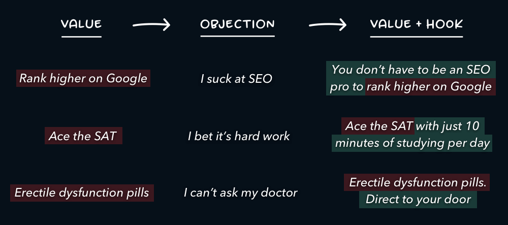
1b. Hooks
Most products aren’t unique. So, a hook is added which addresses your customer’s biggest problem.
1c. Own your niche
Some startups transcend hooks. Another pattern is to own your niche in one line.
Write with conviction that You’re THE solution.

2. Subtitle
Subtitles are where you get specific. Introduce the product. Explain how it creates the value in your title.

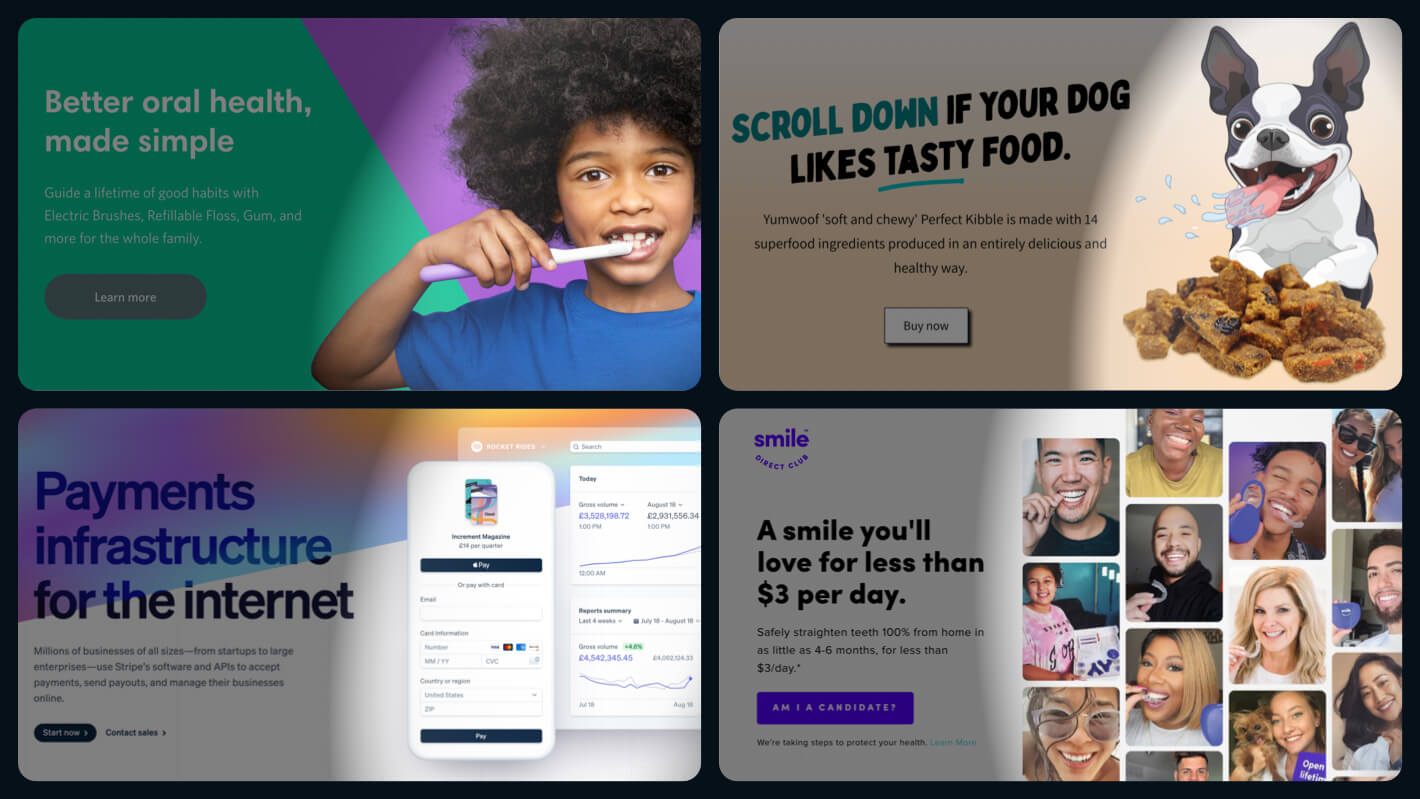
3. Visual
Show off your product in all its glory. The goal is to get as close to reality as possible.
Don’t show me fancy illustrations. Show me your product. Or even better, your product in action.
4/ Social Proof
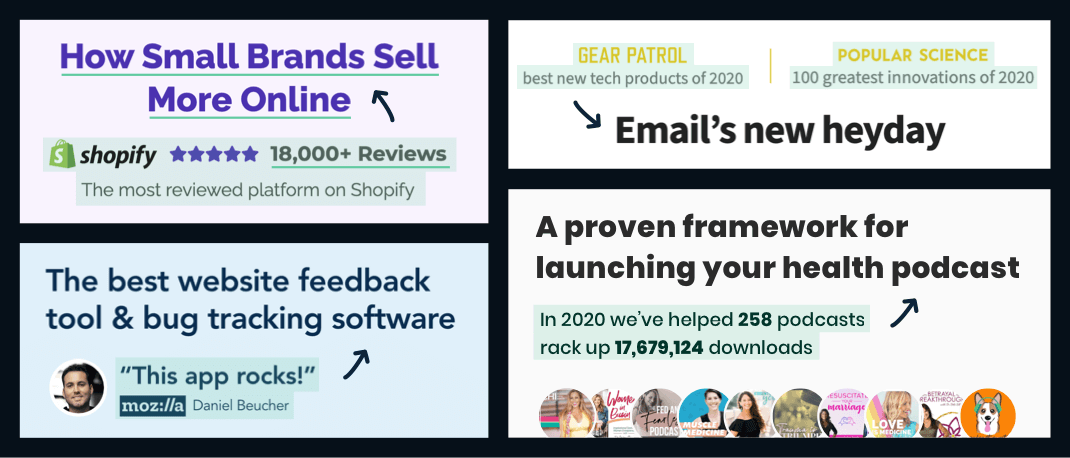
Social proof (above the fold) adds instant credibility to the value you’re promising.
Take Privy for example. Any startup can write “How small brands sell more online”. But it’s their “18,000+ reviews” that make you believe it.
5. CTA
CTA is the next big thing on any landing page.
Most buttons emphasise action: Sign Up, Start Trial etc. Here’s three more compelling CTA types.
5a. Call to value
Buttons which emphasise “value” over “action” usually perform better. The trick is to fulfil the value your title promises.

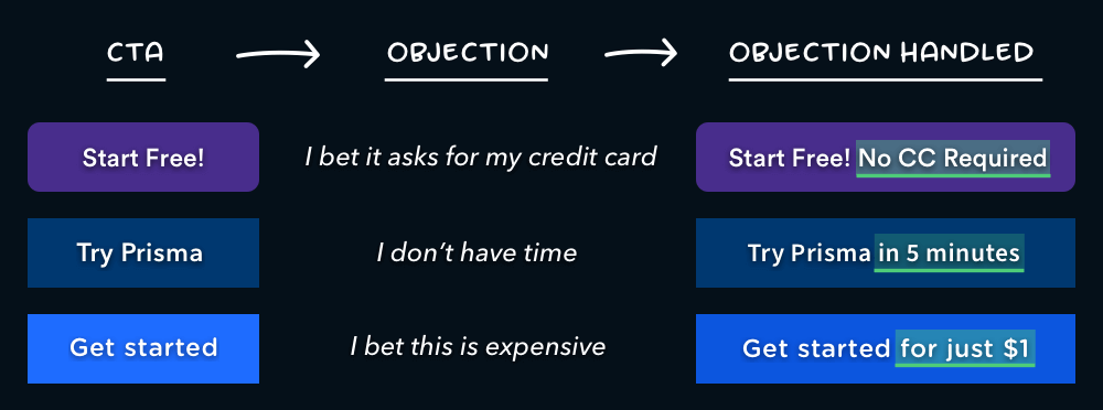
5b. Objection handle
Add a few words to your CTA to handle the user’s biggest objection to clicking.
5c. Email capture + CTA
Pair email capture with your CTA to make signing up as easy as possible.
This doesn’t mean sacrificing customer info. You can always do that during onboarding.
Now, let’s talk about the the elements that come below the fold:
6/ Features and Objections
The first thing you do below the fold is to assure the value you promise above the fold.
Take Riverside for example. Their title promises “podcasts that look & sound amazing”. Their first two features make this promise concrete.

The second thing you do is handle your customer’s biggest objections. This means talking to customers.
Group together reoccurring objections. Use their own words to handle them.

7/ More social proof
Above the fold social proof is about credibility. Below the fold social proof is about inspiring action. It’s a free pass to sell your product.
Use existing customers to bring to life the value you promise.
- “Get a smile you love” ⟶ Customers smiling
- “Email reinvented” ⟶ Customers describing the difference
- “How small brands sell more” ⟶ Sales numbers

8/ FAQ
There are going to be features & objections you want to mention that don’t fit in neatly above. This is where your FAQ comes in.
Write them down. Reframe into questions & answers.

9. 2nd CTA
We’ve done the hard selling. It’s time for our 2nd CTA.
For the second CTA, you only have to remind the customers why they are clicking it.

10. Founder’s note
Finally, you leave the customer with a story that makes you easy to sum up.
1. Put yourself in their shoes
2. Explain their problem
3. Take ownership of it
4. Show the happy ending
You’re walking them down a path they’ll want to walk themselves. Oh, and people buy from people.

Putting it all together
1. Explain the value you provide (title)
2. Explain how you’ll create it (subtitle)
3. Let the user visualise it (visual)
4. Make it believable (social proof)
5. Make taking the next step easy (CTA)
6. Make the value concrete (features and objections)
7. Bring to life your offer (social proof)
8. Tie up loose ends (FAQ)
9. Repeat your call to action (2nd CTA)
10. Make yourself memorable (Founder’s note)

One last thing
Your landing page is your sales pitch. Never forget this. Examine each element & ask:
Would this help me sell if I met the customer in person?
If not, remove it. If you don’t know go out & sell to customers in person.
You’ll learn that fancy words and random images of people shaking hands don’t get you far. More importantly, you’ll learn the attitude of your customer & the words you need to convince them.


