
Imagine starting your day with a cup of coffee and scrolling through your feeds. You come across numerous ads, but then you see a “Work from Home Kit” that promises to boost your productivity. You feel an urge to buy it.

A click on the ad sends you to the product page where you begin your journey of discovery and ask yourself questions like:
- “What is this thing?”
- “Will it work with my Mac?”
- “What colours does it come in?”
- And probably the most important one: “Does this really work? Can I trust this?”
On the road to a conversion, all product pages must answer those questions (and many, many others).
Designing a compelling product page that effectively answers customer questions and converts them into buyers is challenging.
The product page, not the ad, ultimately does the heavy lifting in securing a sale. A well-designed product page streamlines the customer experience by providing clear and relevant information.
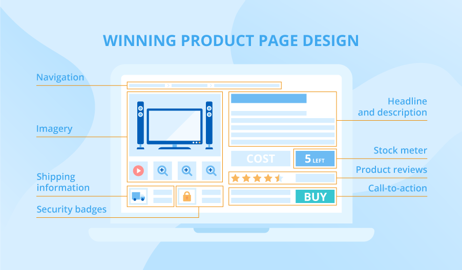
The 4 steps for telling a compelling story on any product page
Quick tip before we dig in: it’s easier to create compelling product pages if you treat each one as a landing page. Now that’s out of the way, let’s go.
Step #1: Know what matters to your customers and use this as the basis for your product overview and product description
Customers want to know how your product will improve their lives and solve their problems. To understand your target audience, conduct customer research through surveys, interviews, social listening, or heuristic analysis.
This qualitative data will inform the copy in your product descriptions, provide tips, and address customer concerns, increasing the likelihood of a purchase.
Let’s look at three product page examples that show this in action.
Example 1: Be specific, descriptive, and helpful
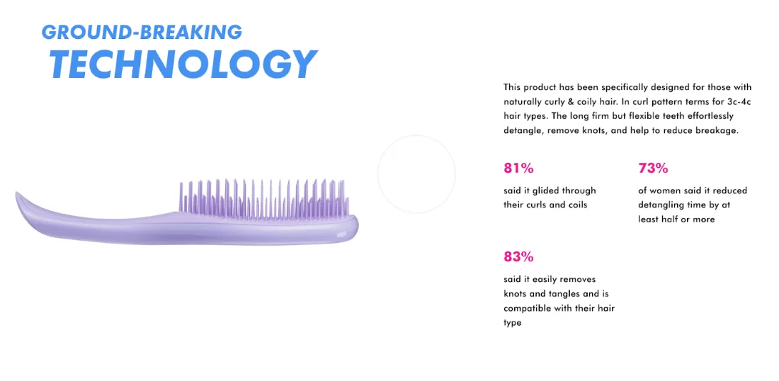
Tangle Teezer offers a range of detangling brushes that help women with various hair textures take care of their hair. The product page below is for their popular Purple Passion brush.
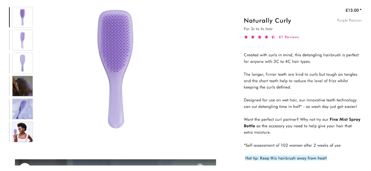
The product description for Tangle Teezer’s Purple Passion brush is detailed, informative, and targeted towards women with 3C to 4C hair textures.
It highlights the design of the brush, including the length and firmness of the teeth, and addresses common hair issues such as frizz, detangling time, and curl definition. The brush is claimed to cut detangling time in half and proper care instructions (keeping it away from heat) are also provided.
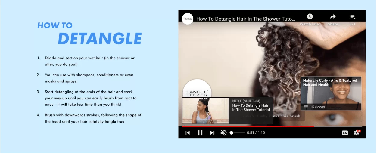
A tutorial video on the page shows how to use the brush correctly.
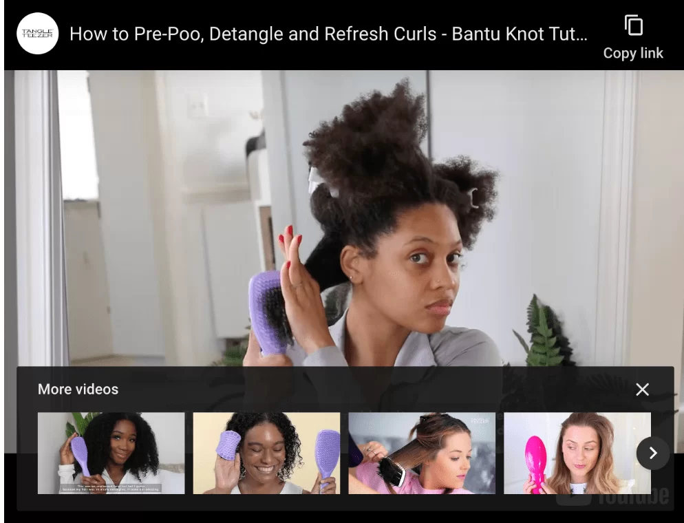
The video tutorial on Tangle Teezer’s Purple Passion brush product page is highly engaging for those in the market for a hair management tool for natural hair. The video features a woman with hair similar to the target audience, making it relatable and helpful.
The step-by-step instructions from the video are also provided in written form on the page, making it even more user-friendly for those who may have difficulty following the video. This enhances the overall user experience and increases the chances of a conversion.
Scroll further down and you’ll see other products that work well with the Tangle Teezer.
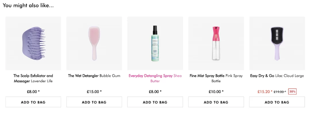
It’s at this point that the company dives deeper into the Tangle Teezer’s features.
This Tangle Teezer example demonstrates the importance of understanding your target audience and addressing their pain points in your product page design.
By highlighting the benefits of the product and providing helpful tips, Tangle Teezer effectively communicates the value of their Purple Passion brush to their target customers.
The combination of storytelling and practical details creates a compelling and informative product page that gives potential customers all the information they need to make an informed purchase decision.
Example 2: Use the right language.
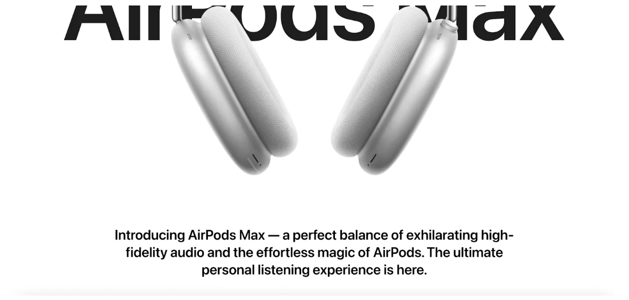
Apple emphasizes the premium design and comfort of the Airpods Max and how they are equipped with advanced technology for high-quality audio.
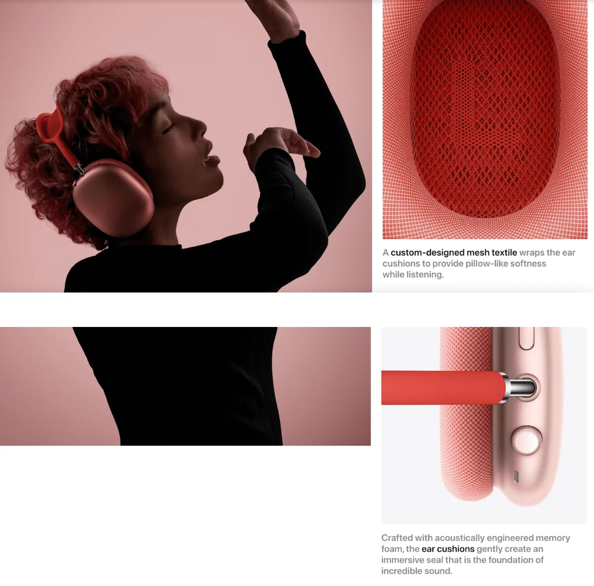
The page includes multiple high-quality images of the headphones from different angles to give a better understanding of the product’s design and features. The page also includes features such as active noise cancellation, spatial audio, and easy access to Siri.
The page also includes video tutorials to show how to use the Airpods Max and how to customize the controls.
All in all, Apple’s product page is focused on delivering a premium experience for their target customers and making sure they understand what makes these headphones unique and worth the investment.
The product page uses high-quality images and videos to show the product in different angles, with different colors and in use.
The images show the product in a visually appealing way and provide a clear picture of what the product looks like, the materials it’s made of, and its features.
The attention to detail is evident in how the product is shown and how it’s described, both of which make you want to know more about the product and how it can enhance your personal listening experience.
Yes, that’s correct. By understanding your customer’s needs and using language and design that appeals to them, you can create a product page that not only informs but also emotionally connects with them.
This leads to a higher likelihood of purchase as the customer feels understood and that the product is a good fit for them.
Example 3: Include enough raw information to help customers make informed decisions
Here’s an example of a product information and overview section from Love Hair.
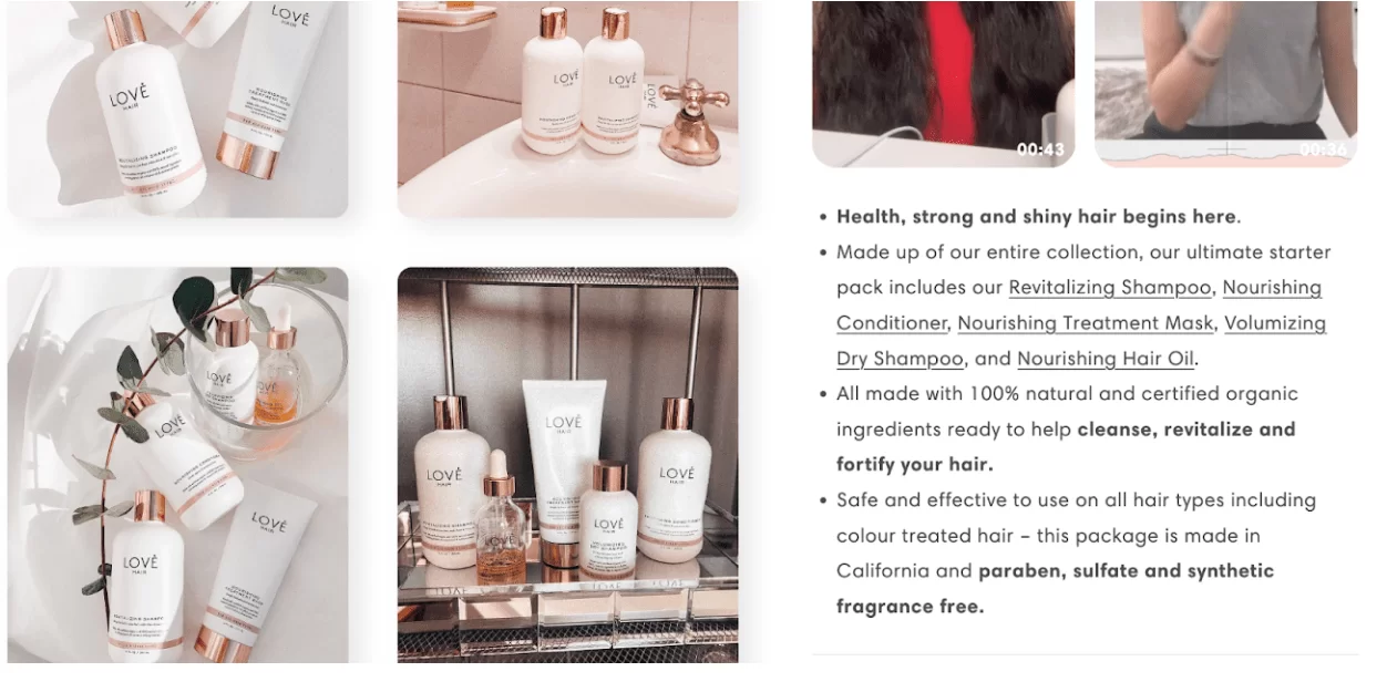
This product overview clearly shows that this product is for women who want:
- Healthy, strong, and shiny hair,
- All-natural products,
- Something for all hair types (even color-treated hair)
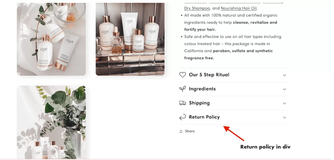
Additionally, the drop-down menu offers a more interactive experience, giving the customer control over the information they receive. By organizing the information in this way, the page remains clean and easy to navigate while still providing in-depth details on the product.
A key consideration here you can use customer research, surveys, and feedback to understand your target audience’s needs and preferences.
This information can be used to craft product descriptions and messaging that resonates with your customers and addresses their specific pain points. By doing this, you are more likely to attract the right customers and increase conversions.
Step #2: Include images that help customers see themselves with the product
Research shows that product information and pictures are important to 85% of shoppers when they’re deciding which brand or retailer to buy from.
There’s also a timeless study by researchers from the Massachusetts Institute of Technology that proves the human brain processes images within as little as 13 milliseconds — much faster than text.
That’s why images are the first things potential customers pay attention to on your product pages. You have to make them count. Here are some tips for optimizing your product page images for conversions.
Don’t just show the product against a white background. Show people using or wearing the product.
These images help potential customers:
- See themselves using the product
- Decide if the product will fit
Here’s an example from Fenty Beauty.
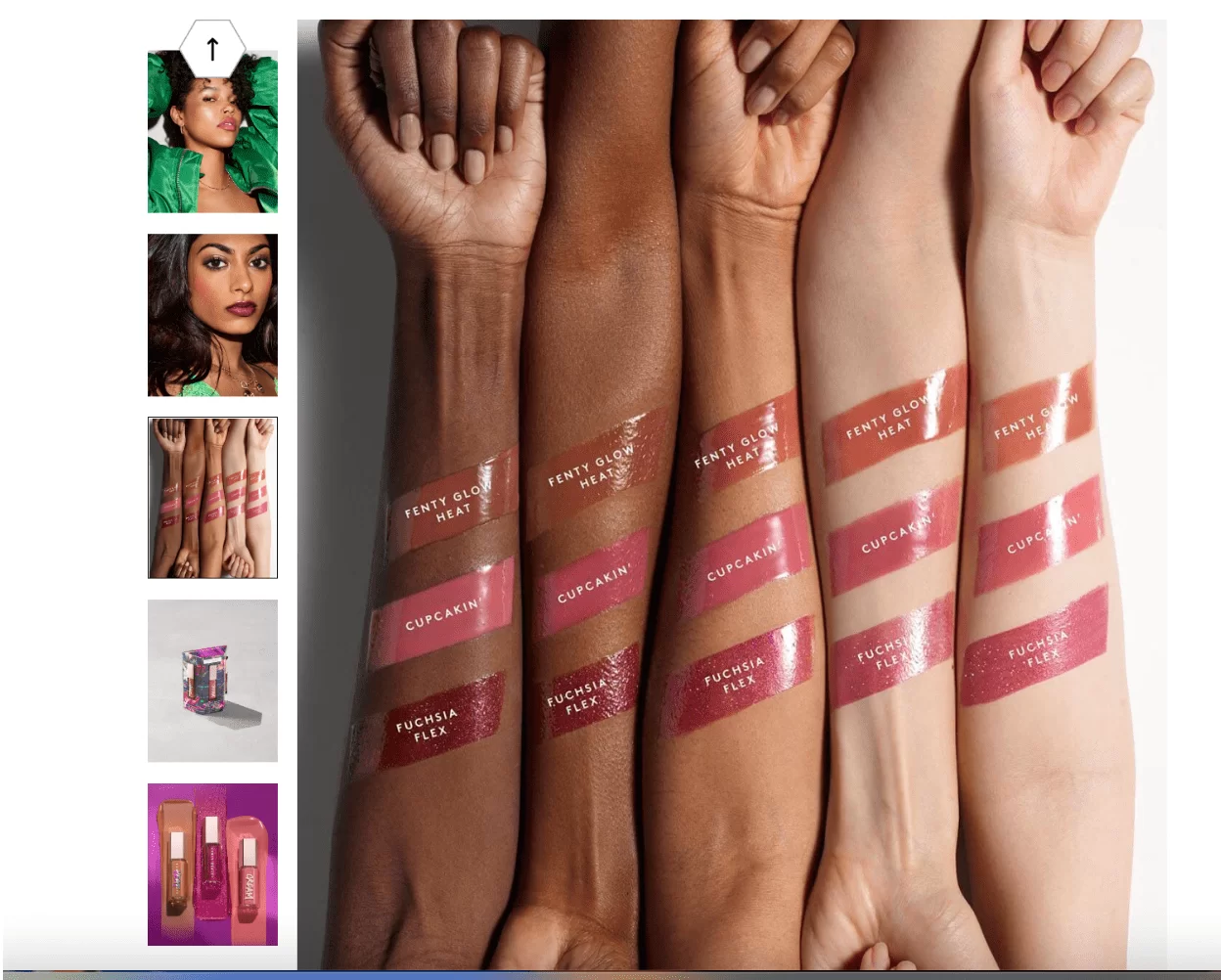
Women with a range of skin tones can see how Fenty’s lip gloss matches their complexions. There are also pictures showing women of various complexions wearing the lip gloss.
Potential customers can use these images to envision themselves wearing the product before they purchase.
Having images of the product in an everyday setting, along with a 360-degree view and magnifier, helps customers visualize the product and understand its size and details.
This can increase their confidence in the product and lead to higher conversion rates.
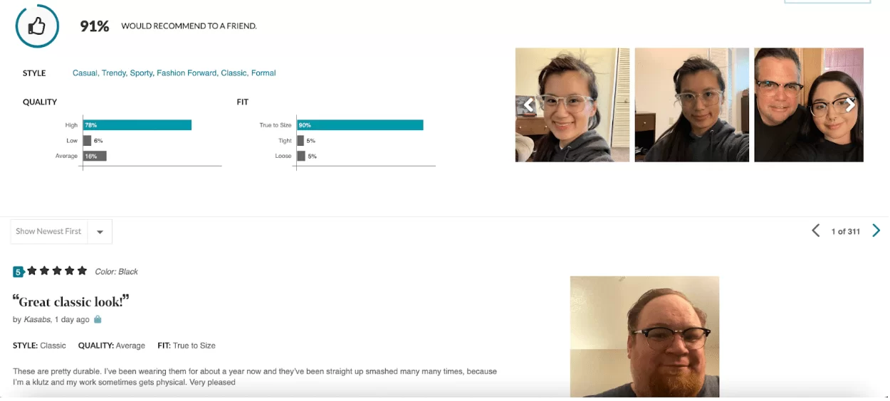
Step #3: Use customer reviews to your advantage
Social proof works best when it’s real and authentic. Displaying customer reviews, ratings, and testimonials can provide this real-world validation to potential customers and help build trust.
Additionally, showing off customer photos of the product in action can also help build credibility. However, it’s important to note that fake or manufactured social proof can actually damage your brand’s reputation and erode trust.
It’s best to be transparent about the source and veracity of your social proof elements.
By displaying customer reviews and images, you demonstrate transparency and build trust with potential customers.
They can see the positive experiences other people have had with your product and feel confident in their own decision to purchase.
These reviews and images can also highlight any common pain points or issues customers have experienced with your product, allowing you to address them and improve.
Here’s an example of a wedding dress:

There is a picture of the dress another bride had altered into another style.
This doesn’t just work with wedding dresses. It works with glasses too. Zenni uses real pictures of their customers to show off their frames.
Yes, customer photos and videos can be a great way to showcase the real-life use of your product, and provide valuable insights for other potential customers.
By including images in your product reviews, you can provide a better visual representation of the product and give customers a clearer idea of what they can expect from the product.
This can help increase customer confidence in their purchase and lead to higher conversion rates.
Step #4: Suggest other products in your catalogue that will pair well with the product
Upselling and cross-selling are two tactics that will help increase conversion rates for your products. A useful approach to upselling and cross-selling is to directly include suggestions for similar products on your product landing pages.
Here’s an example from Pilgrim Collection.
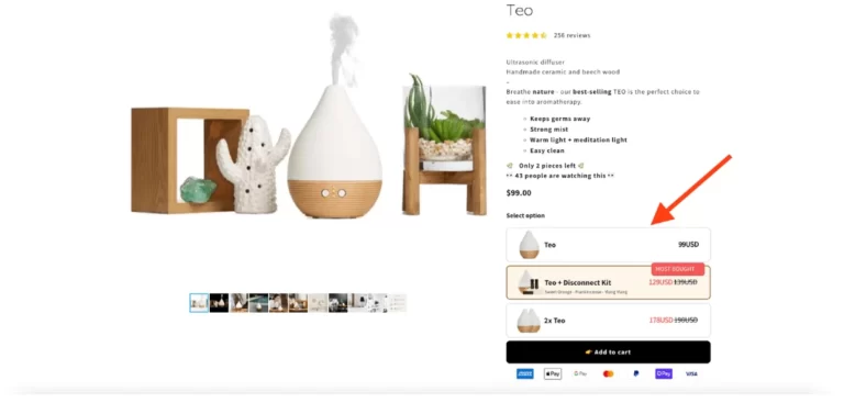
They highlight the pairing of the Teo diffuser with their popular Disconnect Kit with a “Most Bought” tag. Your eyes are immediately drawn there and, if you’re really in love with aromatherapy, you may just consider this incredible pairing.
We did the same for Upright while optimizing their product pages. Through various experiments, we tested showing upgrades, bundles and add-ons to the product page and saw a 13% increase in revenue.
Now that we’ve covered the four-step process for telling a story on your product page, let’s look at some more examples of well-designed product pages.
Examples of well-designed product pages
Let’s take a look at some more real-life examples.
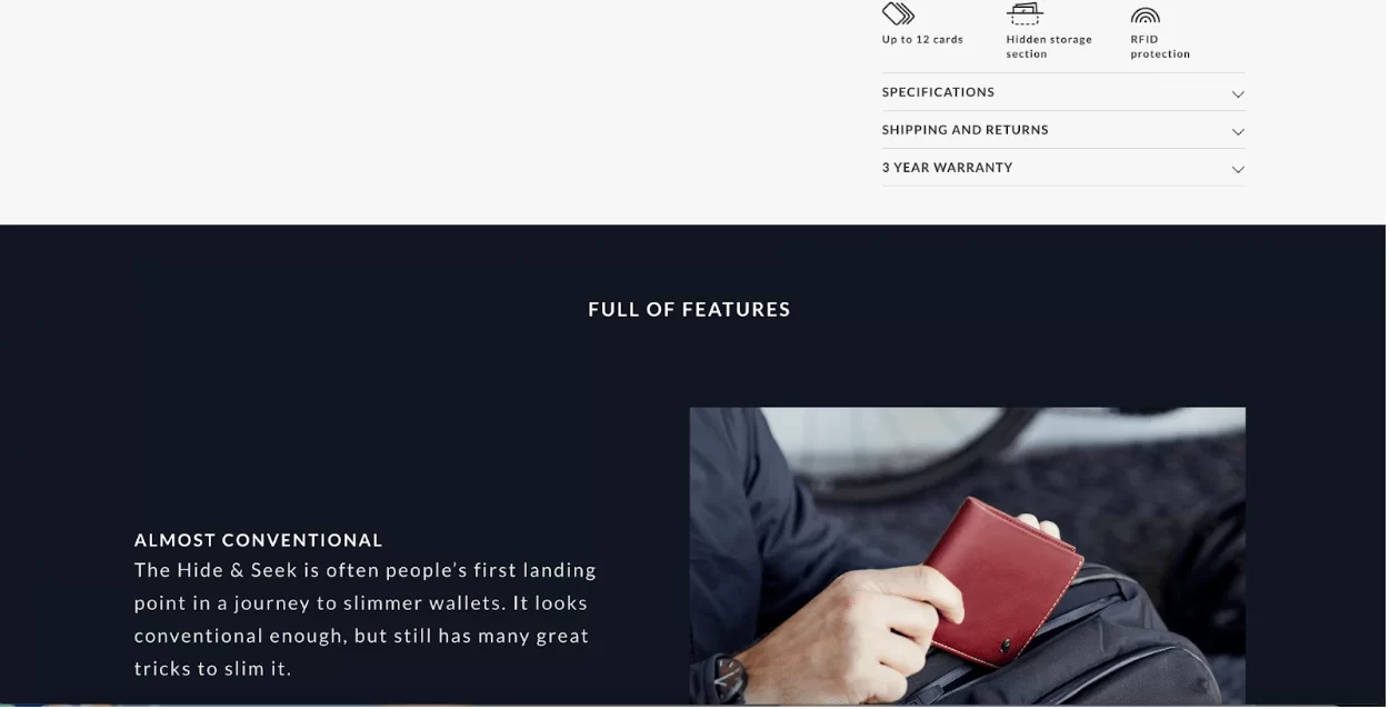
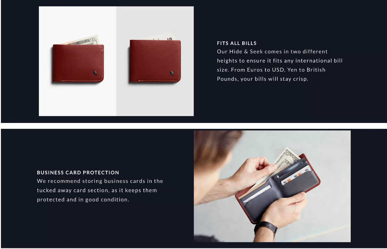
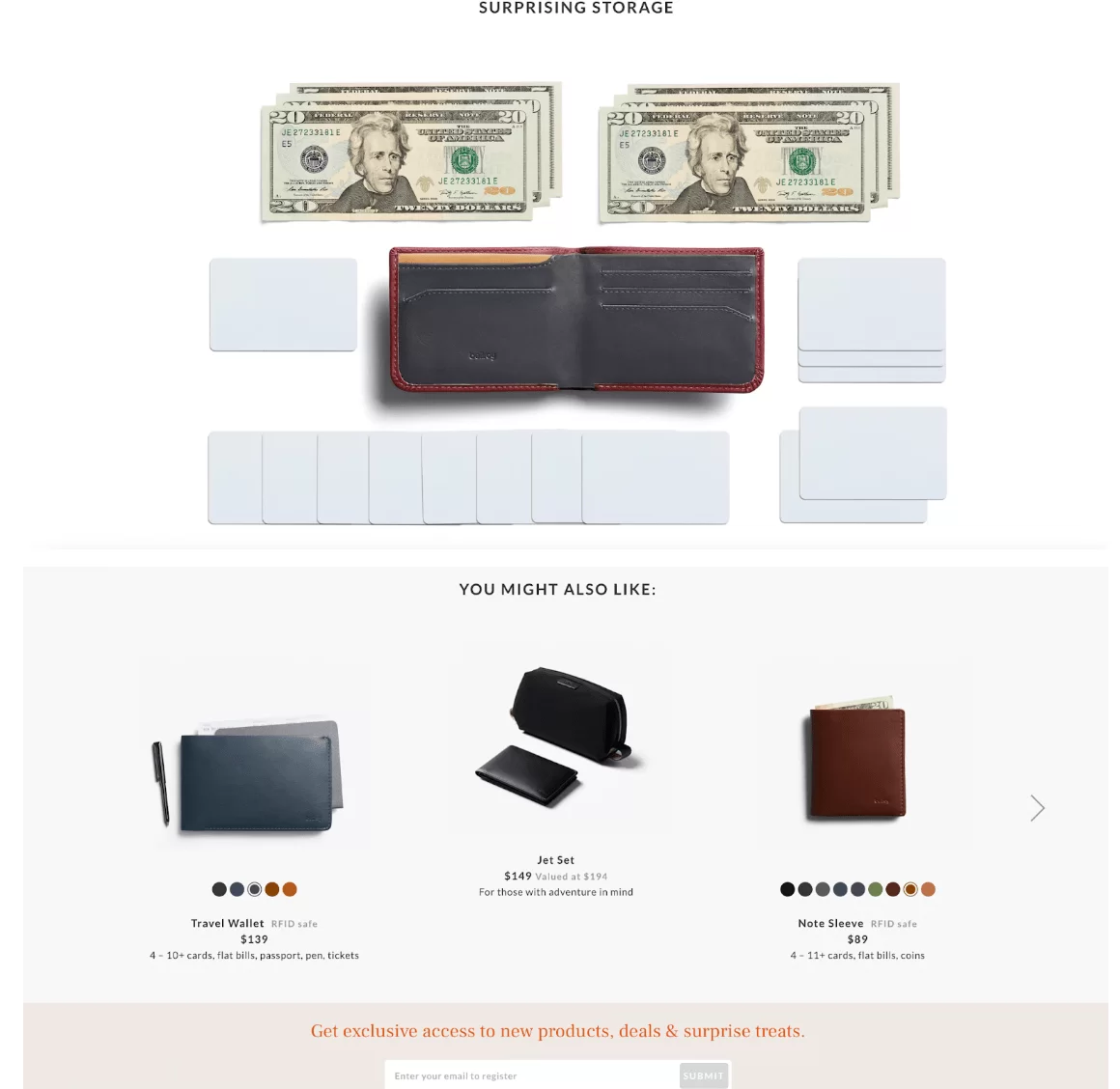
1. Bellroy
One of the great features on this page is the slider which shows what a Bellroy wallet looks like in comparison to an average wallet.
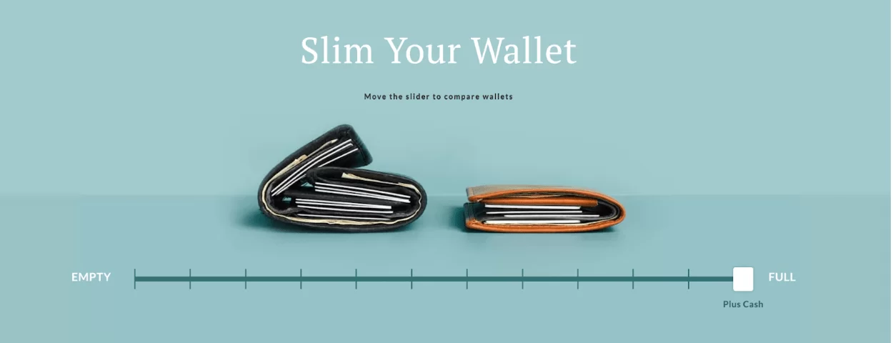
It highlights Bellroy’s selling point. No matter what you have in your wallet, it will always look neat and sleek. As they say on this product landing page, “Our wallets are designed to hold what you need, while keeping your pockets trim and tailored.”
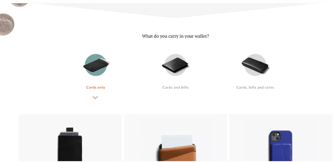
There’s then a personalization element on the page. Here, customers can find the right Bellroy wallets for them based on what they typically carry in their wallets.
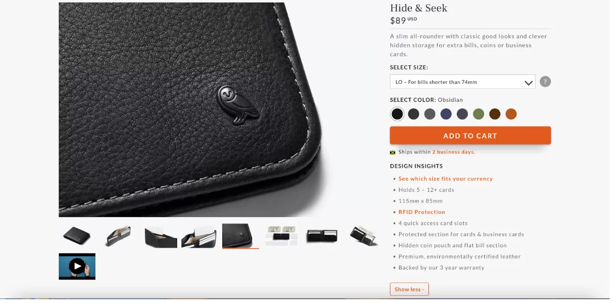
Each product page has all the information a customer needs. Here’s an example from the page for their Hide and Sleek wallet.

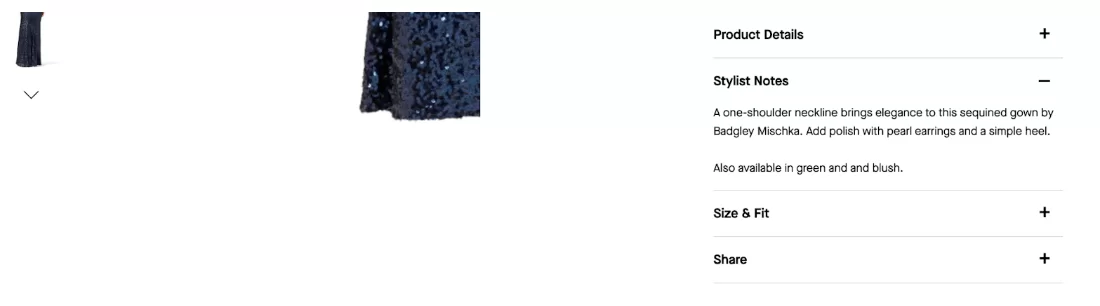
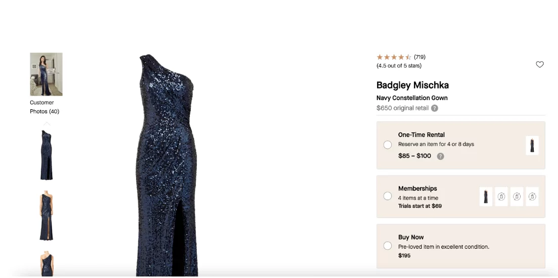
2. Rent the Runway
What’s really great about this product page is the stylist’s notes. Customers can get ideas for how they can dress up their outfits.
Another great feature of the page is that customers can select the buying option that’s best for them — one-time rental, memberships, or buy now. There’s also a comparison to the original retail price which is great for giving customers more context about pricing.
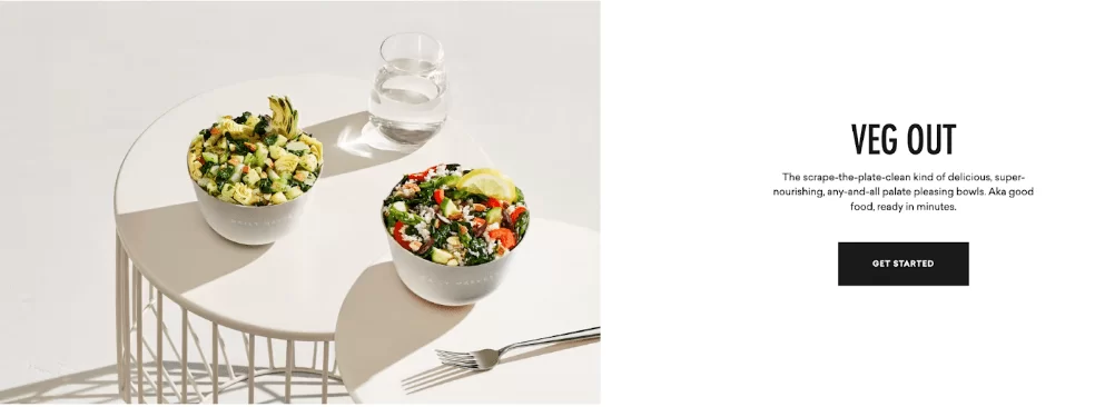
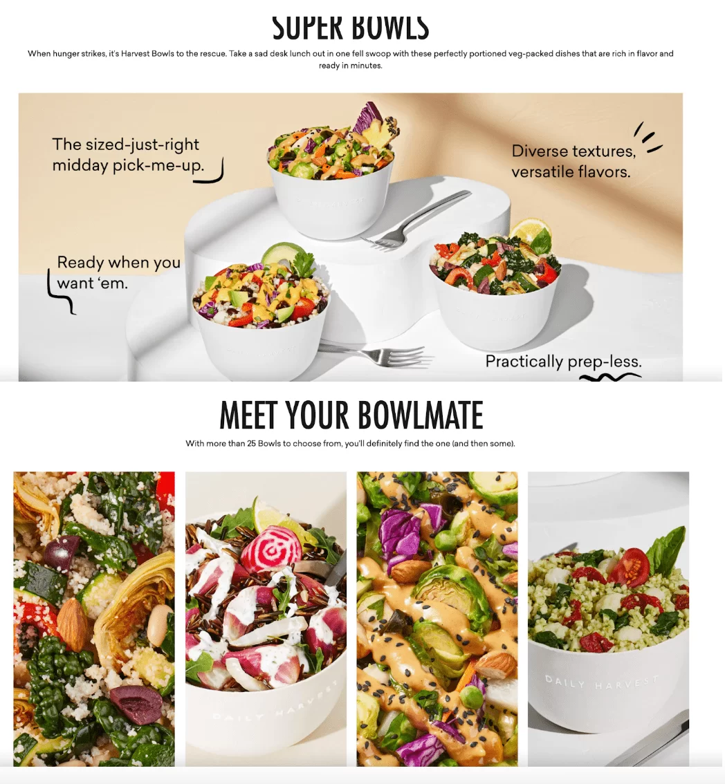
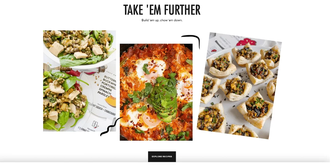
3. Daily Harvest
Not only does Daily Harvest kill it with vivid product images, but they also use the language of their customers in their messaging. They also provide easy-to-prepare recipes that help customers make the most of their bowls.
4. Oragina
This product page is so fun, colorful, and playful!
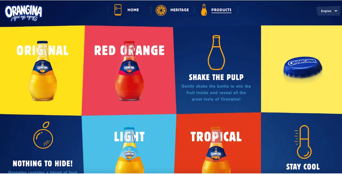
Each product page tells the customer the blend of citrus varieties used for that Orangina drink.
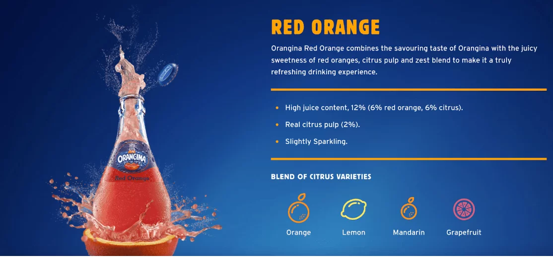
What would have really made these product pages excellent though would have been some recipes and tips for making tasty drinks and meals with these beverages.
Showing customers how to use the drink in various ways would make them see it as even more useful and worth the spend.
Create winning product pages
In conclusion, a well-designed product landing page should have high-quality images and product information, social proof in the form of customer reviews, options for upselling and cross-selling, and a personalization element to help customers connect with the product.
By tapping into the emotions that drive customer purchasing decisions, you can create a winning product page that increases conversions.