As Amazon has changed over time, its logo has shown us a special picture of its journey. The design we recognise and appreciate today is the famous Amazon Smile.
Amazon is one of the most well-known brands. Let’s explore the story of the Amazon logo to discover its past, symbols, and what it means. We’ve added some advice for creating your own special logo too!
Amazon’s early beginnings
Way before Jeff Bezos rocketed into space sporting a cowboy hat and calling it the ‘Best Day Ever,’ he was simply a person with a big dream working in a garage in Seattle. You can locate the exact house where Amazon began here.

In 1994, realising the significant changes the internet would bring to retail, Bezos left his job at a New York hedge fund and relocated to the Emerald City. He then launched an online bookstore. Being one of the pioneers in this type of business, the company quickly surpassed traditional brick-and-mortar competitors.
Interesting tidbit: Initially, Amazon was incorporated as Cadabra Inc, but due to a funny mishap where a lawyer misheard it as ‘Cadaver’ (lol), Bezos wasn’t thrilled about being associated with selling dead bodies. Hence, he switched the name to Amazon, inspired by the Amazon River, the world’s largest river. (Ironically, the river is probably not filled with dead bodies.)
In the end, the name ‘Amazon’ became the core of the company’s logo, both visually and conceptually. The famous ‘Smile’ logo we see today has an arrow that begins at the letter A and points to Z (from ‘A to Z’). This clever motif symbolises Amazon’s vast array of products and comprehensive delivery service.
The evolution of the Amazon logo

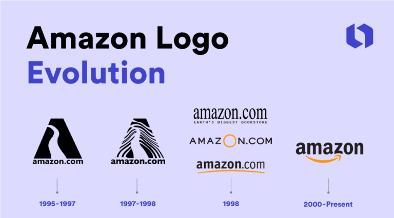
Amazon’s logo has gone through various redesigns over the years, each mirroring the company’s evolution. Let’s take a brief look at the major logo changes in Amazon’s history and explore how other branding elements have evolved with the company’s growth.
Amazon’s original logo (1995-1997)
The first Amazon logo was created by the Turner Duckworth agency in 1995. Interestingly, this same agency would later be responsible for designing the logo we recognise today.

When we look at the original logo, it appears deceptively simple. While its execution may seem a bit dated, Amazon’s first logo follows essential principles of effective design. Remarkably, many of the original design elements from the early days of Amazon have endured and remain part of the brand even today.

The original Amazon logo had a straightforward font displaying the full website name ‘amazon.com,’ a smart choice for an early internet company introducing people to its URL.
Crucially, you can trace the roots of Amazon’s modern, lowercase wordmark back to this original logo, with stylistic similarities evident in the 2023 version.
Additionally, the A in the first logo creatively incorporated an image of the Amazon River as negative space, showcasing the early play with shapes and letters that persists in Amazon’s current logo.
While the initial design may seem a bit dated by today’s standards, it remains an effective and recognisable logo, especially when considering the era it originated in. (And it’s certainly a step ahead of Apple’s first logo!)
Zebra print logo (1997-1998)

The timing of the first Amazon logo redesign around the release of A Night at the Roxbury (1998) is no coincidence. This updated design mirrors the garish late ’90s style and eccentricity, complete with an unexpected zebra print effect that, though seemingly unnecessary, borders on brilliance.
However, the zebra print becomes a distraction, offering little meaningful value to customers and overshadowing the visual impact of the original monogram logo’s river shape.
Fortunately, the ’97 logo was only in use for a year, allowing Amazon to move on from this quirky but short-lived experiment.
Amazon’s 1998 logos

In 1998, a pivotal time for Amazon’s evolution, the company faced the challenge of refining its core brand identity, resulting in the creation of three logos. Although each logo from ’98 might be considered a standalone failure, they contributed essential elements that influenced the logo’s later development as a whole.
The first ’98 logo did away with the monolithic A letter, opting for a serif typeface and featuring the tagline ‘Earth’s Biggest Bookstore.’ Admittedly, it wasn’t great.
The second ’98 logo dropped the tagline and introduced the now classic Amazon yellowy-orange color. Yet, it still fell short.
The final ’98 logo, lasting until 2000 and sucking slightly less, began to tie these evolving elements into something resembling today’s Amazon logo. Here, we see the bold, sort-of sans serif font and the introduction of the orange line beneath the wordmark. This marked a step closer to the recognisable logo we know today.
The Smile logo (2000 – present)
Amazon’s breakthrough logo, a significant development in the year 2000, was crafted by the design agency Turner Duckworth. For more details, you can explore the renowned case study on Amazon’s logo created by the agency.

In this breakthrough design, all the elements from previous logos converge. The curvy orange line, a legacy from earlier iterations, becomes a central feature of the Amazon emblem, now artfully stylised to resemble the iconic smile.
The typography maintains continuity with the previous version, showcasing a sleek, modern font (Officina sans bold) and the omission of the full website name. The smile has evolved into a key component of Amazon’s marketing identity, so much so that it’s instantly recognizable even in isolation on the company’s shipping boxes.
Amazon logo’s symbolism & meaning
According to logo designers, the present Amazon logo stands among the best ever created. It’s praised for its simplicity, cleverness, widespread recognition, and conceptual brilliance.
The 2023 logo brings together all the elements developed in previous Amazon logos: the creative use of shapes, conceptual themes, color, and font. The arrow in the logo stretches from the letter “A” to “Z,” curving to shape a smile.
This design represents customer satisfaction, an extensive product range, and end-to-end service, making it a symbolically rich and visually striking logo.

Across its various logo redesigns, Amazon underwent a noticeable shift in emphasis, moving away from the river theme toward a more specific symbol reflecting its vast product selection and delivery network.
From a design perspective, there’s a clear progression from intricate elements to a cleaner, simplified aesthetic. This shift underscores Amazon’s evolution into a global e-commerce marketplace, prioritising seamless experiences and customer satisfaction.
The logo’s transformation mirrors the company’s journey from its early roots to its current status as a major player in the global market.
The impact of the Amazon logo
In the end, the Amazon logo has played a crucial role in shaping the company’s brand identity and recognition. Its simple yet iconic design has become inseparable from the core values of the company.
Throughout its evolution, the Amazon icon has served as a visual representation of the company’s dedication to outstanding shopping experiences, customer satisfaction, and its expansive product delivery network. The logo has been a dynamic reflection of Amazon’s commitment to excellence in every stage of its development.

The Amazon logo has achieved global recognition, with Amazon Prime even having its own dedicated day. The distinctive smile in the logo reflects the company’s aim to be perceived as a trustworthy brand, emphasising its extensive product range and seamless service.
The Amazon symbol, along with other branding elements in its visual identity, has played a crucial role in establishing and safeguarding the company’s positive image as it has expanded.
Turner Duckworth has consistently applied their approach to logo design across Amazon’s various subsidiaries, ensuring visual cohesion while allowing for unique elements that set each unit apart.
Now, let’s explore some additional logos within the Amazon brand.
AWS

The AWS logo incorporates the distinctive curved arrow from the main Amazon logo, underscoring the connection and integration between the two entities. This design choice visually communicates the relationship and synergy between Amazon and AWS.
Amazon prime

The company’s subscription service for shipping and streaming maintains the essential elements of the main Amazon logo but with notable modifications.
The key changes include replacing “Amazon” with the word “Prime” and introducing the distinctive Prime blue color.
The enduring smile icon demonstrates its strength as a powerful brand symbol, maintaining continuity while signaling the unique identity of Amazon Prime.
Amazon ads

An instance of a straightforward subsidiary logo is the Amazon ads logo, which incorporates the original logo with the word ‘ads’ following in a lighter-weight font. This design maintains simplicity while clearly indicating the specific focus of the subsidiary within the broader Amazon brand.
Amazon music

Another illustration of a streamlined logo adaptation is seen in Amazon Music. It adheres to the established pattern, incorporating the original logo and appending the word ‘music’ in a lighter-weight font. Notably, there’s a distinctive font color introduced for the lighter weight style, contributing a touch of individuality to signify the unique identity of Amazon Music within the broader Amazon brand.
Amazon studios

The Amazon Studios logo stands out as a significant departure from the original design. Featuring a more cinematic style, it employs a white logo font set against a black background with all-caps text.
Despite the variations, all of Amazon’s subsidiaries maintain elements that establish a connection with the overarching Amazon brand, contributing to the cohesion of the overall Amazon ecosystem. This approach aligns with Bezos’s philosophy that ventures like making movies can, in turn, contribute to the success of other aspects of the business, such as selling shoes.
From A to Z: How to start (& finish) your own beautiful logo design

Amazon’s logo has become a globally recognised symbol of the company. Whether viewed positively or negatively, the logo has achieved such profound brand recognition that even the Amazon smile on its own is independently identifiable. This underscores the importance of simplicity, a strong concept, and effective execution in creating an iconic logo.
The evolution of the Amazon logo teaches us a valuable lesson about persistence. Perfecting a logo may not happen right away or even in the initial versions. That’s perfectly fine. Consider how your brand identity can reflect your company’s character. Eventually, you’ll design a logo that aligns with the story you want to convey to your customers.
Amazon’s numerous logo iterations reveal that elements evolve over time, and the truly effective ones endure.


